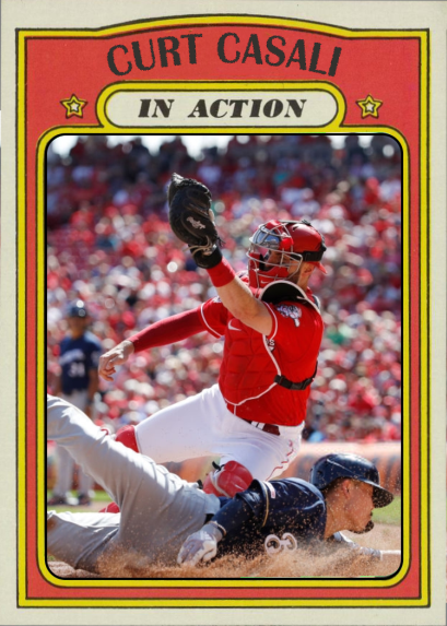
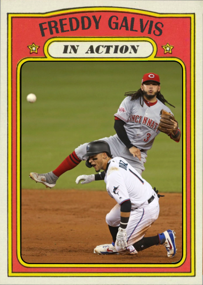
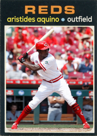
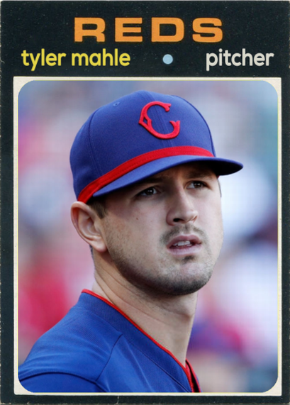
Hello again. I know it’s been a while since I’ve posted any new designs. So, to make up for that, here are the last 9 custom cards I designed before the COVID-19 virus put the 2020 season on hold.
Tag Archives: custom reds cards


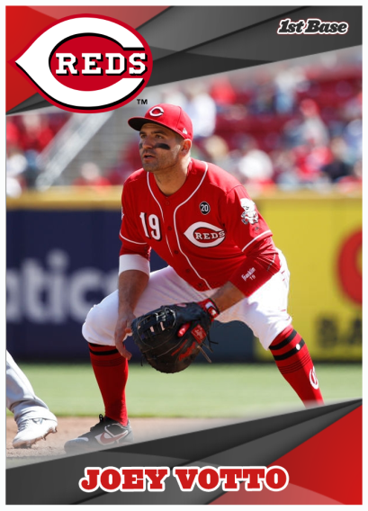
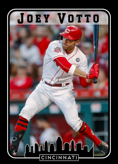
Mr. Votto
If I had to pick one Reds player who just plays the game the way it should be played, who loves the game and has fun with it, I’d have to pick Joey Votto (with Amir Garrett a close second). His leadership, humor, and talent make him one of my all-time favorite Reds.
His disappointment over last year’s performance (.261, 15 HR, 47 RBI) was evident, and he put in the extra work this off-season to make sure his 2020 numbers are better. I’m expecting a BIG bounce-back year from Votto.
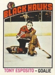
As for these cards, the first one is a custom design of mine. The second card is a spin on an O-pee-chee hockey design.

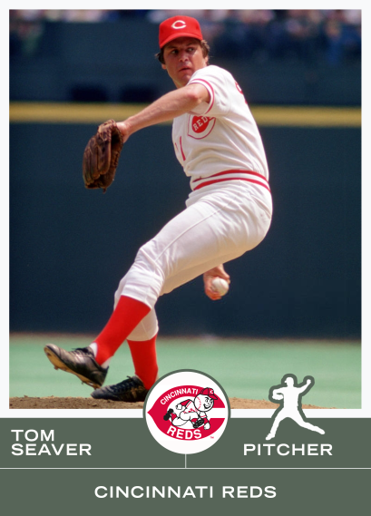
I created these 1981 alternate cards for Seaver & Foster but never posted them. Foster was always the nicest guy, but he would crush the souls of opposing pitchers.


Summer of ’65
Last night I created my own template for the 1965 Topps cards. I absolutely love the Reds’ yellow-and-blue design from ’65, so I made a few classic and modern cards with the template.


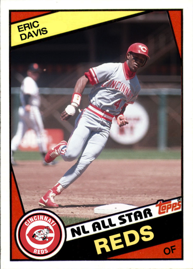
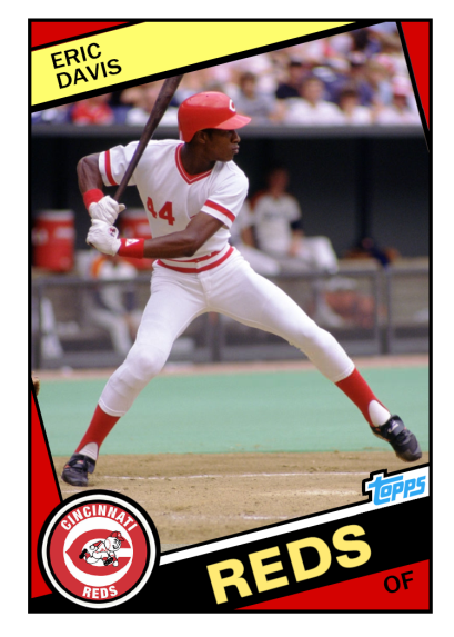
UPDATE: One of the members of Facebook’s “Custom Baseball Cards” group asked me to create a card for his “2nd favorite Red,” Eric Davis. I love Eric the Red, too, so here’s that card:

New Perspectives
Here’s a new custom design I’ve been working on. It’s still a bit of a work-in-progress, but I’m liking it so far.
This design is the result of playing around with the “Perspective” option in Photoshop to see what I could do with it.
As for the uniforms…one looks like a bad softball uniform and one is a classic.

Takin’ out the trash
Not every design works. Sometimes, a design will just come together in a few minutes. And then there are times when I slave over a design for hours, and still never get something I feel is good enough to post (and sometimes I look back on designs I’ve posted and wonder, “What was I thinking?”). Here are a few cards that have never been posted before. They’ve been in my folder for a long time, but I’m not a big fan of ’em, for whatever reason.
If you see any of these that you like, please let me know. I’m always interested in what people think of my designs.


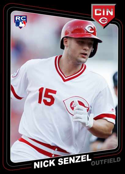
Shogo Goes to Cincy!
The Reds have finalized a deal with Shogo Akiyama. The 5-time Nippon League all-star will become the first Japanese-born player to sign with the Reds. He’s projected to start in center for the Reds in 2020.
(It’s also possible that Shogo’s acquisition puts the pieces in place for the Reds to acquire Francisco Lindor from the Indians. We’ll have to wait and see about that, though.)

1984 Remixes
I absolutely love the 1984 Topps football design. Everything about it just…works.
These guy were all part of the 1984 Reds team that won 70 games and finished 5th in the NL West. Only the 66-win Giants kept the team out last place. In 1985, though, the Reds righted the ship and won 89 games.
I’ve made cards for Davis before, but these are my first for Parker and Oester. I like seeing Parker in the red & white uniform instead of those ugly black and yellow ones.


More ’72s
Here are a few more 1972 Topps cards for future and current Reds.
I’m not sure how many of these guys are part of the Reds’ plans for 2020. The Reds tried to land Grandal and Gregorius this off-season, but it remains to be seen which moves the team will actually make. I’m excited to see Moustakas in a Reds uniform, at least.
Random Bag of Customs
These 5 custom designs have been gathering dust in my “cards to psot” folder for quite a while. I’m not really thrilled about any of them, but I don’t hate any of them, either. They’re all just kinda…decent, in my opinion.
I think my favorites are the Bench and the VanMeter with the “2020” flag, but I feel like both designs are still missing something.


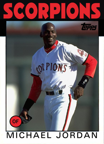
Billy Hatcher & Some Other Guy
Made a couple of cards with the Topps 1986 template.
The first card is for Billy Hatcher, who had a 12-year career in the majors. He’s probably best remembered for his role on the 1990 Reds team that won the World series.
The other guy, Michael Jordan, never quite made it to the majors. He played for the Birmingham Barons and Scottsdale Scorpions in the minors. He retired with a lifetime .202 BA with 3 homers.

New Custom Set (“The Green Thing”)
Here’s my latest custom design. It’s not too flashy, but I like the simplicity of it. The green color I used comes from an old scoreboard. I used the player icons like the old Topps cards, but I created new, modern-looking versions of them.


More Custom ’73s
Made a couple more cards with my 1973 template – one for “Prime Time” and one for Tony Perez (with a cameo by some dude named Mays 😁).


Joe “White Shoes” Morgan
I updated my ’74 Topps template and created a few cards for members of the Big Red Machine. I love the pic of Morgan because it shows him wearing white shoes. This was a major violation of Sparky Anderson’s rules. I’m guessing he probably got fined for wearing them.


Random set of ’71s
Here’s a random sampling of some of my 1971 custom card designs. These were all created at different times over the past few months.
Some are landscape, some are recolored, some are from 1971, some are modern, some are from a different template.


1975 Topps Customs
The 1975 Topps set went kinda crazy with the color combinations. I made my own template for this set, and it was fun playing with the different color/photo combinations.
All of these cards use the color combinations Topps actually used in ’75. I’m working on another post that will feature some of these cards with color combinations I created myself.


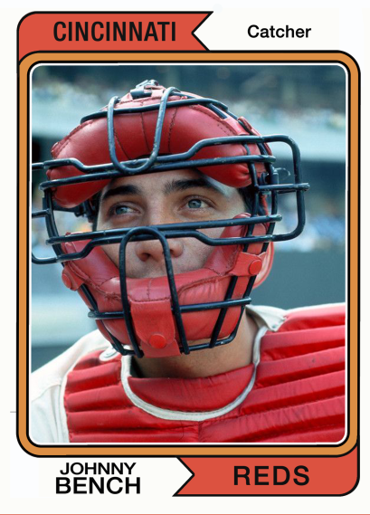
’73 Topps Template
I’ve always loved the basic, classic look of the 1973 Topps cards. I never had many of these back in the days when I collected cards, but the ones I did have were some of my favorites – especially the Roberto Clemente one (that card was another tragic flooding victim).
So last night I spent some time creating my own 1973 Topps Template. This Photoshop template is pretty detailed – it has all of the player position icons and the different color circles Topps used that year. I also had to make horizontal and vertical layout versions for this template, so that was a bit more work.
As I was testing the layout I used the two pics of Johnny Bench you see below. I also wanted to use this great pic of Hal McRae and Andy Etchebarren meeting at home plate. Sadly, Mr. Etchebarren passed away a few weeks ago. I remember having a lot of his cards when I was growing up.
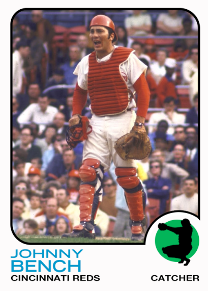
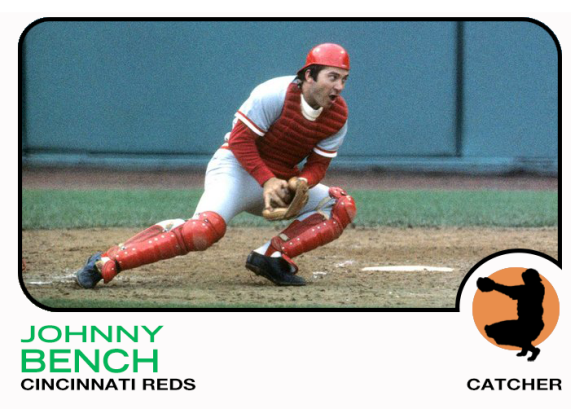

Note: I should point out that none of these pics are actually from 1973. The vertical Bench pic is probably from 1970, before the Reds started playing their games at Riverfront Stadium. The horizontal pic is from the 1975 World Series, and the McRae/Etchebarren collision occurred during the 1970 World Series. If any of you were aware of this fact before reading this note, then…you are way more detail-oriented about this stuff than I am.
Anyway…here’s a card that does have a pic from 1973: first baseman Dan Driessen making sure the Mets’ Dave Schneck doesn’t steal second.

The Great American Ballpark Customs
My latest set of custom Reds cards uses the shape of the Reds’ stadium as the cutout area for the player’s image. I’ve played around with this design a lot over the past few days, but I’m pretty happy with it for now.
This set also includes the two newest Reds – Justin Shafer and Nick Martini were claimed by the Reds earlier this week. Martini joins Travis Jankowski as the second former Padres outfielder to join the Reds this off-season.


Here’s an earlier version of the cards that I was considering. This one shows the basepaths and foul lines. I like that this version makes it more obvious that the shape is a field, but it’s also a bit more cluttered. I would love to hear your feedback on which version you prefer.


Latest Custom Designs
My latest custom design. It looks pretty simple and basic, but it actually took me a while to make the background of the photos black & white, while keeping the players in full color.


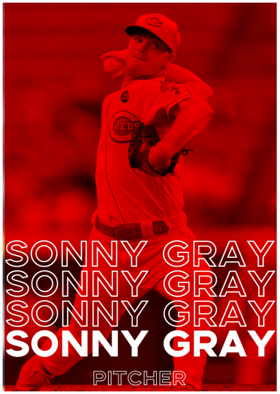
Text Warp
I almost titled this post “Let’s Do the Text Warp Again,” but I resisted the urge.
This design has a weird history. You see, I download a lot of other cards & images for inspiration. I just stick them all in this big folder on my hard drive. A few days ago, while looking through that folder, I stumbled across a design I didn’t remember seeing before. I had no idea where I found it, but I liked it.

So I decided to try my own version of that design, mainly because it was a good way to practice using Photoshop’s Warp tool. Here’s the version I ended up with:

I still wanted to know where that design came from, so I did some digging. Turns out it was a custom card created by the Rockies organization. It was one of several custom cards they posted on Twitter earlier this year.
UPDATE: A member of Facebook’s Custom Baseball Cards group pointed out that the design is fairly close to the 1976-77 Topps Hockey design: