Hello again. I know it’s been a while since I’ve posted any new designs. So, to make up for that, here are the last 9 custom cards I designed before the COVID-19 virus put the 2020 season on hold.
Tag Archives: Suarez


The More You Know…
I loved the design of the 2008 Topps Football cards. They were simple, clean, and a little retro. They reminded me of the cards I collected as a kid.
So I decided to take them into Photoshop to create baseball versions of this design to see how they would look. Here are the results:


I liked ’em, so I shared them to the Custom Baseball Cards group. Seconds later, I was informed that Topps had actually used the exact same design for their 2008 football and baseball card designs.
Yep…I spent my time creating a design that had already been used.
As someone who hasn’t purchased a card of any kind since roughly 1990, I’m really not up-to-speed on anything that’s happened in the baseball card world since then. This has never been so glaringly obvious as it was this morning. I got a good laugh out of it, at least.
Removing Backgrounds
One of the main reasons I started this blog was to document my progress with different Photoshop techniques. One of the skills I’ve been trying to improve lately is the ability to remove the backgrounds from photos.
There are free services that will do this for you, like Remove.bg, but those sites reduce the image size. I try to work with only high-res images, so this is a problem. The images I post here are scaled down to roughly 1/4 of their original size. I would post the full versions, but I’ve been warned that shady characters out there are likely to try to sell them on eBay.
Lately I’ve been working on removing backgrounds with Photoshop’s “Quick Selection Tool.” It takes more time than the free services, but maintains the full image resolution.


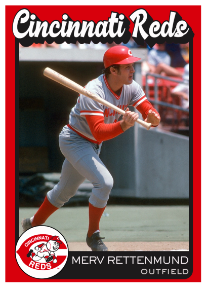
The Spirit of ’76
The 1976 Topps set was one of the first that I collected as a kid, so I’ve always had a soft spot for that design. Ever since I started this blog, I’ve wanted to be able to recreate that design. The problem was those little position icons on the lower left. I couldn’t find clean versions of those icons to work with, and without those, the whole card just looked bad.
Fortunately, Bob Jonas from the Custom Baseball Cards group was kind enough to share a set of icons that he had cleaned up. I worked in Photoshop to try to nail every little detail of the 1976 design – from the fonts down to the exact borders around those icons.
Here are the results – 6 alternate cards for the 2020 Reds. I even made one for the newest Red, Travis Jankowski. Janky plays every OF position, so he’ll probably get a chance to play a lot in early 2020, especially if Senzel isn’t ready for the start of the season.


1953 Remixed
I saw a custom Topps 1953 card that looked pretty interesting, so I decided to do my own version of that year’s design. This was a pretty basic design, but I ended up playing with the minor details quite a bit. I wasn’t really loving it until I lowered the opacity of the background and added a black layer underneath it.


First set of custom cards
Lately I’ve been working on my own custom designs instead of using old templates from real cards.
I’m not totally thrilled with any of these designs, but it’s been good practice. I’ve got a lot of ideas that I want to try, so I’m sure I’ll be posting more custom cards in the future.
If you have any feedback on these designs – positive or negative – I’d love to hear it. You could even go down in history as the very first person to leave a comment on this new blog. (Note to self: gotta work on site promotion sometime.)


Where were you in ’77?
Here are the rest of the cards I created with the Topps 1977 template. I’ll definitely be making more of these in the future, but right now I’m focusing on making a few of my own custom card designs.
(Also, my sincere apologies go out to Brian O’Grady. Yesterday, I posted a rookie card for him…and then he got sent back to the minors. I’m a jinx.)
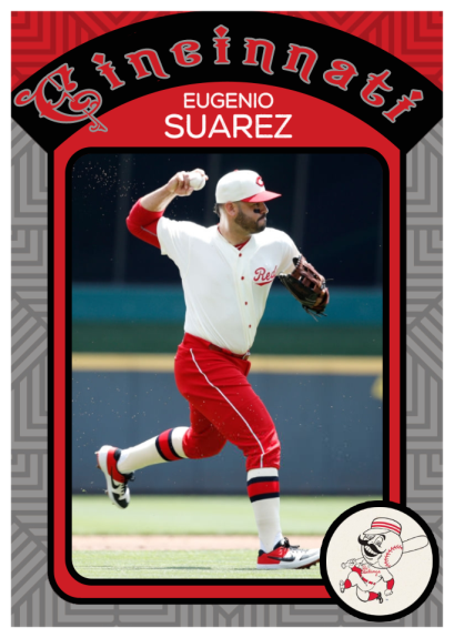
The Suarez card below reminds me of a card Topps made in ’76 for Kurt Bevacqua – the league’s bubblegum bubble-blowing champ.


