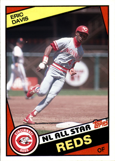
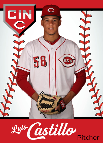
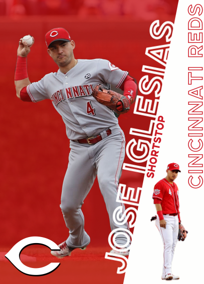
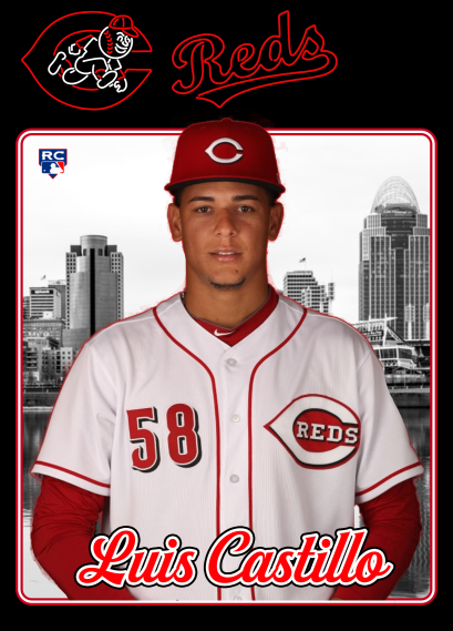
Hello again. I know it’s been a while since I’ve posted any new designs. So, to make up for that, here are the last 9 custom cards I designed before the COVID-19 virus put the 2020 season on hold.
Tag Archives: custom cards


A Brady Bunch
With Tom Brady going to the Buccaneers for next season, a lot of fans have started Photoshopping Gisele’s husband into Bucs uniforms.
The first two card show Tommy Boy in Tampa Bay’s uniform from last season, which he will never actually be wearing. The third card shows Tom wearing the NEW Buccaneer uniform, which is based on a leak from UniWatch.


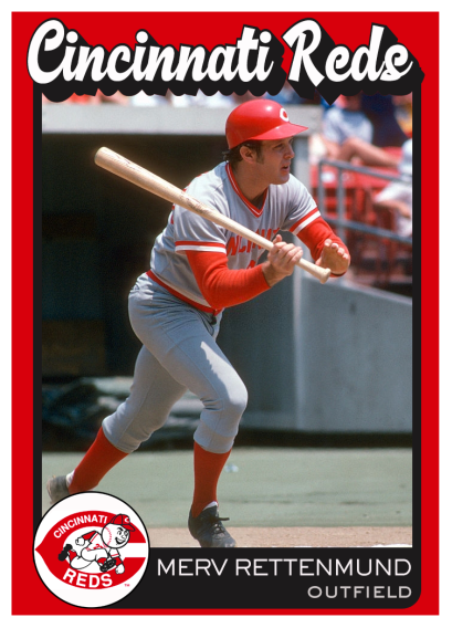
I created these 1981 alternate cards for Seaver & Foster but never posted them. Foster was always the nicest guy, but he would crush the souls of opposing pitchers.


Takin’ out the trash
Not every design works. Sometimes, a design will just come together in a few minutes. And then there are times when I slave over a design for hours, and still never get something I feel is good enough to post (and sometimes I look back on designs I’ve posted and wonder, “What was I thinking?”). Here are a few cards that have never been posted before. They’ve been in my folder for a long time, but I’m not a big fan of ’em, for whatever reason.
If you see any of these that you like, please let me know. I’m always interested in what people think of my designs.


’74 Pirates
As a diehard Reds fan, I don’t make too many cards for the Pirates. But I couldn’t resist making cards for these classic photos.
I doubt we’ll ever see a modern-day player in a photo like this one of Dave Parker.


A-Rod Sucks
A-Rod ranks pretty high on the list of “Players I Hate the Most.” So this picture of Jason Varitek shoving his glove in A-Rod’s stupid face will always be one of my favorite baseball pictures.

A member of the Facebook Custom Cards group asked for the card below. I think it makes a nice companion piece.

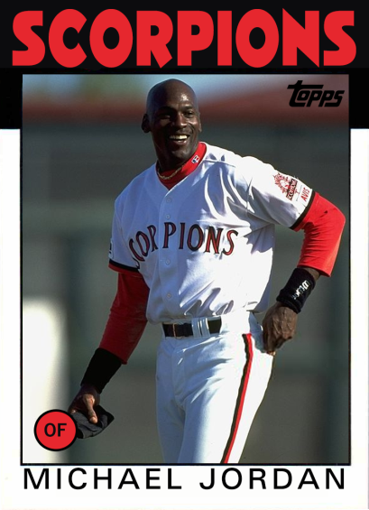
Billy Hatcher & Some Other Guy
Made a couple of cards with the Topps 1986 template.
The first card is for Billy Hatcher, who had a 12-year career in the majors. He’s probably best remembered for his role on the 1990 Reds team that won the World series.
The other guy, Michael Jordan, never quite made it to the majors. He played for the Birmingham Barons and Scottsdale Scorpions in the minors. He retired with a lifetime .202 BA with 3 homers.

Manny Being Manny
When I saw this pic of Manny Ramirez, I felt like it was just begging to be on a card.
I love knowing that, even if this card didn’t have Manny’s name on it, most baseball fans would recognize who it is. It would be like making a Curt Schilling card with just his bloody sock on it.

Latest Custom Designs
My latest custom design. It looks pretty simple and basic, but it actually took me a while to make the background of the photos black & white, while keeping the players in full color.


Text Warp
I almost titled this post “Let’s Do the Text Warp Again,” but I resisted the urge.
This design has a weird history. You see, I download a lot of other cards & images for inspiration. I just stick them all in this big folder on my hard drive. A few days ago, while looking through that folder, I stumbled across a design I didn’t remember seeing before. I had no idea where I found it, but I liked it.

So I decided to try my own version of that design, mainly because it was a good way to practice using Photoshop’s Warp tool. Here’s the version I ended up with:

I still wanted to know where that design came from, so I did some digging. Turns out it was a custom card created by the Rockies organization. It was one of several custom cards they posted on Twitter earlier this year.
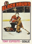
UPDATE: A member of Facebook’s Custom Baseball Cards group pointed out that the design is fairly close to the 1976-77 Topps Hockey design:
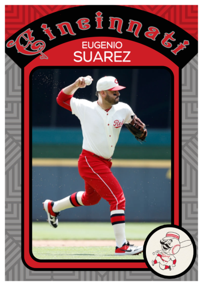
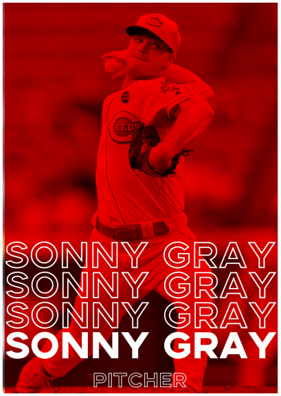
6 New Custom Designs
I work on a lot of custom designs, just to try out different techniques and experiment. Here are six recent designs I made that haven’t been posted yet.
I like a couple of these more than the others, and I’m still thinking about making larger sets with some of these designs.
I’d love to hear your feedback on which of these designs you like or dislike.


Nick Esasky & other ’85 Reds
Here are a few 1985 Reds remakes.
In 1984 Nick Esasky played in 113 games…and had a .193 average. But the next year, he batted .262 in 125 games.
I don’t know how many players have ever raised their batting averages 69 points from one year to the next, but it can’t be too many, right?


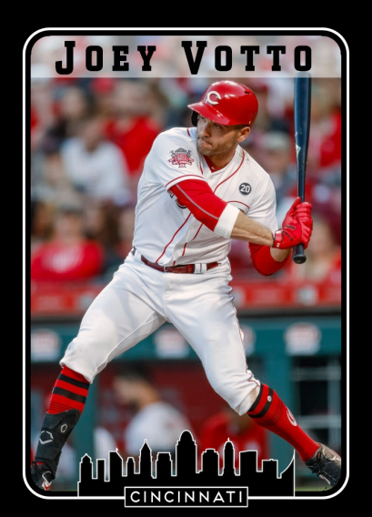
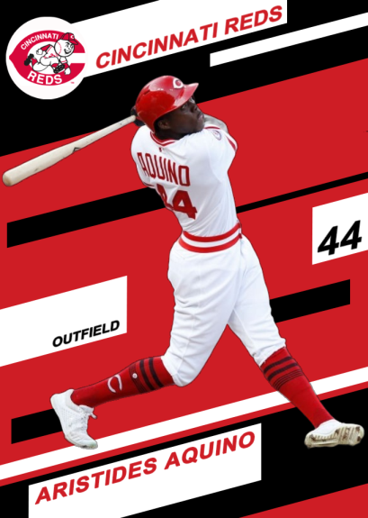
New Custom Reds
Here’s another new custom set I’m working on. I’m not 100% sure about the fonts I used, but I really like the “box” style for the team & player names.
I love this photo of Denard Span at Fenway Park, so I threw that Rays card in as a bonus.


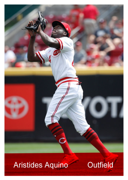
Custom Reds Set
This design is based on the wonderful “Brothers” typeface. Brothers was designed by John Downer and released through Emigre in 1999. You can read more about Brothers at the Font Review Journal (which is a fantastic resource for font enthusiasts).
This is a really simple design, but I kinda love the look of the Bench card in this set.


Turning Japanese
“I got more hits than Sadaharu Oh” – “Hey Ladies” by The Beastie Boys
Japanese baseball legend Sadaharu Oh ended his career with 868 homers and 2,786 hits. Sadly, the Beastie Boys never had 2,786 hits.
While researching Japanese baseball card design last night (I’m a nerd…I know), I decided to make these two cards. One is for Oh, of course, and features a shot of him as he broke the all-time home run record.
The second card is for Kosuke Tanaka of the Hiroshima Carp. The Carp share the same “C” logo and colors as the Cincinnati Reds, so it fits with this blog’s “alternate Reds” theme.


Tweets
I wanted to create a card design that would show a little more of each player’s personality, so I’m working on a design that will show one of the player’s recent tweets. I’m still playing with this idea, but here are a couple of early test cards:


UPDATE: After playing with the design a bit more, I ended up here:


Two artists
Here are a couple of new takes on the 1980 Topps template.
I love both of these pics for different reasons. The Concepcion card shows how he used to make the tough plays at shortstop look so effortless. And the Warhol card just makes me laugh. Why is he wearing a Reds cap and holding a pug? Who knows. And who cares? I mean, it’s Warhol.


1971 Topps Football Remixes
The 1971 Topps football design was kind of quirky. The lower left corner featured a cartoon drawing of each player position. That made it a bit more difficult to remix the card for a baseball design.
Fortunately, I was able to find the two cartoon characters you see in the design below. I also helped that the characters were already wearing uniforms like the Reds.
It also took me a little while to find the font used for the team names. I’m using Rama Slab here, which isn’t a perfect match, but it’s pretty darn close.
As a side note…I would pay a lot of money to see the Reds use these uniforms in every game next season.


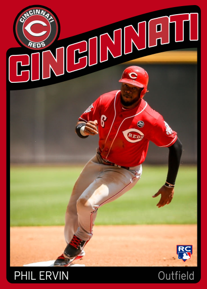
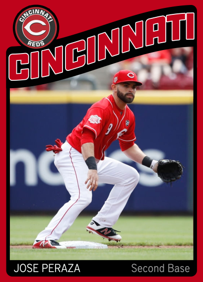
1973 Football Remixes
Here’s another set of football “remixes.” This time, I took the 1973 Topps football design and converted it into baseball cards. I changed the colors to reflect the Reds’ color scheme (the original cards seemed to ignore team colors altogether).
I added the current Topps “rookie card” logo to the O’Grady card, since he made his major league debut this year. I still prefer the old All-Star trophy logos, but this one is growing on me.


Neon Lights
One of the members of Facebook’s Custom Baseball Cards group posted a really nice basketball card design that used a neon look for the team and player names.
I decided to take a shot at my own neon design, and came up with this after a few failed attempts. This is more of a rough idea than a finished, polished, pixel-perfect design…but I’m liking it so far.


